Photoshop for Web Site Design
Saturday I completed a total redesign of the Chicago Society for Space Studies web site – which in part explains why I haven't been posting new entries here lately. And since I was in the process of doing the redesign, I took the opportunity to also write an article outlining the process. That article – A Web Site Redesign – appears on my Astrodigital web site.
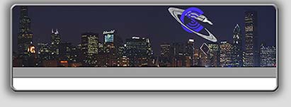
The redesign I performed would not have been possible without the use of 2D graphics software. Of course my software of choice is Adobe Photoshop. While I have used Photoshop before to create buttons, logos, banner images, and web page elements, I had never used it to create a total graphic page design. That design, shown above, was actually quite easy to create.
For the banner image, I felt that a night view of the Chicago skyline would be most appropriate since it combines the elements of Chicago and space via the presence of the night sky. The Chicago skyline is a composite of two photographs taken at night from the site of Chicago's Adler Planetarium. To capture the two images, I set my camera up on one of my tripod's and shot in manual mode, which allowed me to control ISO, speed, and aperture. I also created a new version of the CSSS logo that fit in better with the banner image color wise.
The most time consuming part of the design process was not the actual creation of the design, but rather coming up with the mental image of the type of design I wanted to create. I was guided in this process by looking through free web site template sites. There is more on that in the A Web Site Redesign article.
Realization of the site graphic/design was accomplished by creating a multi-layered Photoshop document. I started by creating a solid background, the color for which I was sure to note as I would use this color to define the web page's background color in the CSS (Cascading Style Sheet) file. This was layer one. On layer two I made a rectangular selection of an area of the same size as the page area, feathered the selection, and filled it with a dark gray: this would serve as the shadow area around the page content area. Back to the rectangular marquee, on layer three I selected a rectangle and filled it with white: this would serve as the content area background. On layer four I added the Chicago skyline image. I placed the CSSS logo on layer five. By putting the logo on its own layer, I was free to experiment with positioning the logo and while keeping my options open for any future changes. Next up the layer ladder, on layer six I created a rectangular selection and filled it with gray: this would be the area used to hold the horizontal navigation bar. Layer seven was used to create the frame that serves as the page border. The frame around the page was made by simply creating a rectangular selection, feathering the selection, converting the selection to a border selection, and then stroking the path. I then used a layer style to give the border a 3D effect.
It was all pretty simple actually. The final step was to switch to ImageReady and slice up the image into the appropriate components. It was then necessary to create the CSS that would reassemble the individual graphic components while allowing for content control within each of those individual areas.
Once I had my CSS and XHTML template created, it was just a matter of replacing the old page layout code with the new code. Not mentally challenging but tedious. The worst part of the whole process was validating all the HTML associated with the content as I had decided to change from coding using an HTML doctype to an XHTML doctype.
If you want to take a closer look at the design, and learn a little bit about space in the process, I encourage you to visit the Chicago Society for Space Studies web site.
Ad Astra, Jim
| Return to the Blog Index | This entry was posted on Monday, July 16th, 2007 at 11:32 am and is filed under Photoshop, Web Design.