Artsnova Digital Art Gallery – Mobile Friendly At Last

Artsnova Digital Art Gallery responsive design for Smartphone
One of the projects that I've been working on – off and on as time permitted – over the last few months has been to recode my Artsnova Digital Art Gallery web site in order to improve the site's usability for mobile users. Specifically I was working to create a responsive web design version of my web site.
My old design (which this WordPress blog still uses) used a fixed-size layout so that no matter what your device's form factor (screen size), the relative size and placement of images and the flow of text was identical across the board. This made design and maintenance a simple matter. Pages would look the same to everyone. This approach works great for the desktop.
As more surfers spend more time using their mobile devices to surf the web, it becomes more important that web sites migrate to a design methodology that is friendly to mobile users. This is because of the way in which mobile device browsers display traditional web pages. If you pull up this blog post on your smart phone's browser, the entire page will be displayed on your screen – but everything is going to be so small that you won't be able to read anything or click any of the links without first manually resizing the content. In addition, my site was using the hugely popular CSS dropdown menu method for site navigation. It works great on the desktop but not on mobile devices.
The percentage of traffic my site gets from mobile users is in the teens – up from the mid-single digits of just a couple years ago. As I expect that trend to continue, I felt it was time for me to sit down and create a web site that would be friendly to mobile users.
I opted to go with a responsive web design solution as that would require only a single code base – as opposed to maintaining one code base for desktop users and one or more additional code bases for mobile users. What is responsive web design? Responsive web design uses HTML (HyperText Markup Language) and CSS (Cascading Style Sheets) to create a web page whose layout is dependent on (responsive to) the size of the screen it is being viewed in. That's it. The main benefit is that responsive web design allows me to create a single web page that gets delivered to all users – as opposed to creating one version of a web page for desktop users, another version of the page for smartphone users, and another version of the page for tablet users. My web site currently has 329 HTML pages (not counting the pages associated with my blog). Responsive web design means 329 pages and one set of CSS definitions. The non-responsive alternative would mean 987 pages and three sets of CSS definitions. That's a lot of work and means a lot more maintenance in the future. And it's worth pointing out that I don't use a CMS (Content Management System) for my site. I've coded everything by hand as static HTML pages.
In addition to developing the necessary CSS code to implement a responsive web design, I had to recode and test each of my site's existing web pages. While for most pages these changes were fairly standard, I have a number of pages that presented particular challenges due to their content.
Another aspect of my design is that it does not use Javascript. Everything is done using HTML and CSS3. I've avoided Javascript for two reasons. First and foremost, not using Javascript makes for a faster page load – particularly for mobile devices. Second, not using Javascript means that there is one less component of my site's code base that I have to maintain. Of course not using Javascript means that my web site lacks the dynamics and interactivity features that Javascript makes possible. However, hopefully you are coming here for the content and not visual bells and whistles.
Last night I put the finishing touches on my new design and took the plunge of rolling it out – even though I haven't tested as thoroughly as I should. However, my schedule over the coming months has little spare time so better to act now and deal with issues as they arise.
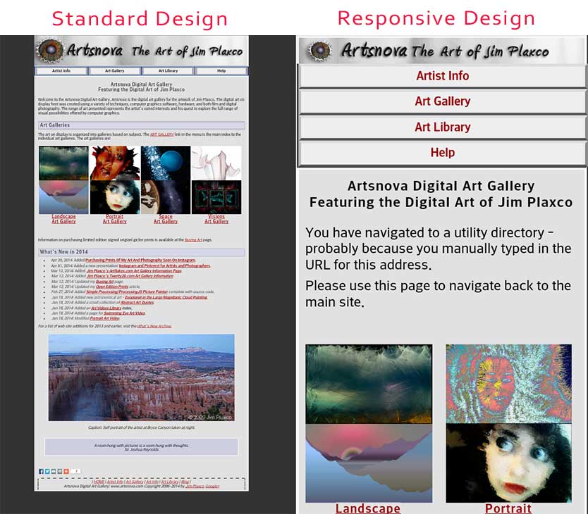
To see a full side by side visual comparison of my standard vs responsive design home page as seen on my Android smartphone, clip on the image below.
What About My Blog?
If you're reading this on a mobile device, you can see that I have not converted my blog to a responsive web design. Converting my blog to a responsive design would take almost as much time as it took me to convert my web site. Fortunately (or unfortunately) I created my web site and blog separately. Later on I created custom WordPress templates in order to visually integrate my blog into my web site. This approach has worked quite well but it means that the two are designed and maintained separately. For the foreseeable future, I will not have the time to spend on converting my blog to a responsive design.
References
In learning about responsive web design and in coding up my design, the two books that I made the most use of were:
- Implementing Responsive Design: Building sites for an anywhere, everywhere web written by Tim Kadlec and published in 2012 by New Riders (one of my favorite publishers of computer books)
- HTML5 and CSS3 Responsive Web Design Cookbook by Benjamin LaGrone and published in 2013 by Packt Publishing
Closing Thought
As a parting shot, I'll leave you with this quote by Microsoft's Bob Herbold: "It's not the technology, folks, it's the people. When we trace [the errors] back, it's always human error." Of course what he doesn't say is that for the most part the people making those errors are Microsoft's programmers.
| Return to the Blog Index | This entry was posted on Thursday, September 25th, 2014 at 3:01 pm and is filed under Computing, Web Design.