Artsnova Digital Art and Space Blog
Blog Update
January 23, 2024: As a part of the redesign of the Artsnova website, I have converted the Artsnova Digital Art and Space Blog from the Wordpress CMS (Content Management System) to a custom off-line CMS of my own design. As deployment of this new website is driven by the plan renewal due date of my hosting plan - and wishing to avoid at all costs renewing with the company that bought the hosting company I had been using, my time has been dedicated to coding up the new website. Given the age of the most recent blog post on my 'heritage' blog, I will only add blog posts here that have been written after January 23, 2024. You can access older blog posts either via the categories listed below or via the Blog Archives Index.
Newest Blog Posts
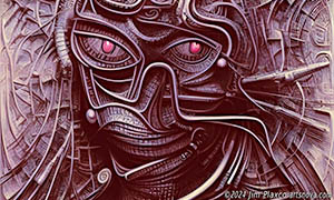
AI Generated Art - The Story Behind The Alien Biomech Portrait
2024-03-26: The story behind the creation of Alien Biomech Portrait generative AI artwork is that it was one of many generative AI artworks I created as a part of doing research for two generative AI workshops I taught in 2023. One was for a science fiction convention and the other for students attending a space development conference. In the processing of deleting the art that got created during that process, I decided to keep this one and a number of others based on their artistic appeal.
Continue reading AI Generated Art - The Story Behind The Alien Biomech Portrait
A Redesigned Artsnova Website Part 1
2024-01-25: It is now 2024 and my deployment of a newly designed Artsnova website is finally a reality. I'm embarrassed to say that this has been a couple years in the making and is long overdue. I'm also embarrassed to say that during this period I have added very little new content to the website and wrote no blog posts. I'd like to share with you some of my thinking with respect to this website redesign.
Continue reading A Redesigned Artsnova Website Part 1