A Mobile Friendly Artsnova Blog
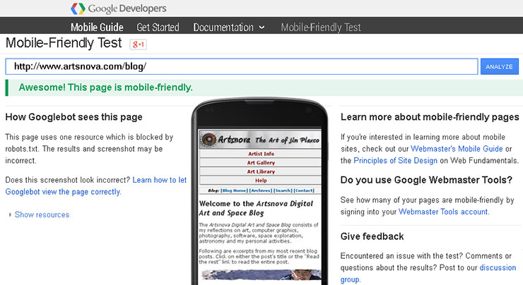
Google Developer Says I'm Mobile Friendly
Last night I held my breath and swapped out my old blog theme files and CSS with the new responsive web design replacements I had just finished coding up. Why? Well, if you follow the news of the web then you are no doubt aware of the big change Google made last month (4/21 to be exact) to its search engine ranking algorithm. The heart of that change was to penalize web sites that are not mobile-friendly – or to put a positive spin on it – to reward web sites that are mobile friendly.
It was last September that I re-coded my main web site using the responsive web design paradigm to make my web site mobile friendly. You can read about that in my post Artsnova Digital Art Gallery – Mobile Friendly At Last. And in December when I launched my Jim Plaxco Photography web site, I did it as a mobile friendly web site from the start. It's much easier to design a mobile friendly web site from scratch than it is to convert an existing web site!
Tackling my blog was another matter entirely, particularly since I had to first edit all of my previous blog entries to ready them for use with a responsive web design layout. That took time. Plus I had to insure that the responsive design theme I came up with for my blog provided the same look and feel as my separately managed web site. This extra challenge is a consequence of having created my web site first and only later adding a blog – for which I simply used a default theme at the time. With all the other items on my agenda, I really did not want to spend time making this design change but I viewed it as a necessity given Google's actions. Note that mobile visits to my web site for the last month accounted for 16.9 percent of my traffic.
I'm happy to say that the implementation work is now done. I only have two more tasks. First I must revisit all my posts that contain embedded videos and determine how I will handle them as they use a fixed-width definition (just 425 pixels wide so not a big deal – I just need to create a CSS class for them). Second, I need to revisit every blog post using a combination of browsers and mobile devices to make sure that nothing broke in terms of the page layout. You could say that I'm doing my testing in a "live" environment. This is not considered good practice but given my time constraints, it is a better course of action for me to pursue.
If in the course of wandering around my blog you find something amiss, please contact me so that I can put things right. Thank you.
Happy Surfing!
| Return to the Blog Index | This entry was posted on Monday, May 4th, 2015 at 8:28 am and is filed under Computing, Web Design.