Photography: Composition, Color, Contrast
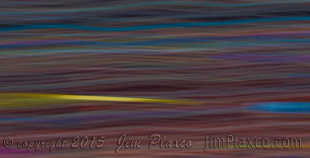
Neon Waves abstract photograph
Monday night I attended a meeting of the Schaumburg Area Photographic Society with a photographer friend of mine. My renewed interest in photography is a consequence of my decision late last year to launch a photography web site – Jim Plaxco Photography – which went live December 12 2014. Over the years I have amassed quite a large collection of photographs and at long last I summoned up the energy to curate my collection and begin to make a small fraction of it available online.
As it turns out the meeting we attended was one of the club's regular competition nights where photographs are judged and honors awarded. Judging was done by a panel of three judges. Judges are typically members of another camera club or of the PSA (Photographic Society of America). The photographs being judged were those submitted by club members (you must be a member to participate in the competitions). The three categories of images were DPI (digitally projected images), small prints (11×14), and large prints (16×20). The special theme for the DPI images was "Water".
The judging of the photographs lasted for just over two hours. Once judging began I quickly picked up the habit of scoring the photographs myself and comparing my own scoring with that of the judges. With few exceptions the scores I gave each photograph fell within the range of scores awarded by the judges. In scoring I tried as much as possible to be subject-neutral. In other words I treated a photograph of, for example, a pretty girl the same as I treated a photograph of a park bench.
For my part, the factors that guided my scoring were composition, color, and contrast. Note that while color and contrast or value are typically thought of as being elements of composition, I address these components separately. For composition, I was making an aesthetic judgment on factors like cropping/framing, balance/weight of the shapes, spatial relationships, and line. For color, I was looking at color saturation, balance, and the interplay of color and central subject. For example in a few images the color saturation had been pumped up too much for my tastes. For contrast, I was looking at the dynamic range of brightness in the photograph and whether it enhanced or detracted from the subject. The important thing to remember is that there is no one right answer to the question of composition, color, and contrast. A particular combination that works brilliantly for one photograph can fail miserably for another. In summary the experience was a good exercise in looking critically at imagery and was time well spent.
The Schaumburg Area Photographic Society meets September through May on the second and fourth Mondays at the Schaumburg Community Recreation Center (CRC). The next meeting is February 9, 2015 and will feature a presentation by club member Bob Benson on Optimizing Images which will cover using Adobe Lightroom, Adobe Photoshop, and Adobe Elements to enhance digital photographs.
The Illustration
To illustrate this post I used is a highly cropped version of my abstract photograph Neon Waves. This photograph was make using a combination of long exposure and camera motion. The truth is that it took quite a few attempts with different settings and motion on my part before I achieved the effect I was trying for. And yes, this is a single exposure image.
Reference Links
- Schaumburg Area Photographic Society
- Schaumburg Area Photographic Society Winning DPI (Digitally Projected Images) 2013 – 2014
- Jim Plaxco Photography
- Wikipedia entry on Composition
| Return to the Blog Index | This entry was posted on Thursday, January 29th, 2015 at 4:13 pm and is filed under Digital Photography.